Building a CSS flexbox engine in Go
I rebuilt CSS flexbox in Go to lay out a terminal UI framework. The interesting bugs were the places where the terminal disagreed with the browser: integer coordinates that needed float math, text wrapping that couples height back to width, and a box model that mostly evaporated.
The framework is go-tui. You write
.gsx templates with HTML-like syntax and Tailwind-style classes, and a
compiler generates type-safe Go from them. Here's a centered greeting in a
bordered card:
templ Hello() {
    <div class="flex-col items-center justify-center h-full">
        <div class="border-rounded border-cyan p-2 gap-1 flex-col items-center">
            <span class="text-cyan font-bold">Hello, Terminal!</span>
            <br />
            <span class="font-dim">Press q to quit</span>
        </div>
    </div>
}
The part that makes this work is the layout engine. When a template says
flex-col gap-1 grow, something has to turn those declarations into actual
coordinates on a character grid. In a browser, that's the CSS flexbox algorithm.
I wrote my own flexbox implementation for the terminal.
This post is mostly about the bugs. Reimplementing a spec gets interesting where your target environment disagrees with the spec's assumptions.
Why not wrap an existing engine?#
Facebook's Yoga is an excellent flexbox
engine used by React Native. But it's written in C, and wrapping it means CGO.
CGO complicates cross-compilation and forces anyone building the code to have a
C toolchain. For a Go library that should work with
go install and only has four external dependencies (all in the extended
standard library), that's a non-starter.
Also a terminal is different enough from a browser that a browser-targeted engine would need significant adaptation anyway. Terminal coordinates are integers on a canvas that's maybe 200 columns wide, text measurement is character counting rather than font shaping, and CJK/emoji characters take two cells instead of one.
The core algorithm ended up requiring around 600 lines of code.
Characters are strange pixels#
A terminal is a fixed grid of cells. Every cell is 1 unit wide and 1 unit tall, and an 80x24 terminal has 1,920 cells you can treat as pixels.
Measuring text means counting characters. "hello" is always 5 cells wide. That simplicity is appealing until you hit the edge cases of swapping pixels for characters.
CJK (Chinese, Japanese, and Korean) characters and many emoji take two cells. The engine tracks this per cell, marking the phantom second column of a wide character as a "continuation cell" with width 0. Every place that measures width has to account for this.
Another problem is precision. A browser viewport might be 1920 pixels wide. A terminal is 80 columns. Being off by one pixel in a browser is invisible. Being off by one character in a terminal is immediately obvious, and it turns out that flexbox involves a lot of division.
The six phases (and one extra)#
My implementation follows the same general structure as the CSS flexbox spec, broken into six phases. Each phase answers one question and feeds its answer forward:
- Base sizing: how big does each child want to be before any flexing?
- Space distribution: there's leftover (or missing) space; who gets it?
- Min/max clamping: did any child end up outside its allowed range?
- Justify positioning: where along the main axis does each child sit?
- Cross-axis alignment: where does it sit perpendicular to the main axis?
- Coordinate conversion and recursion: convert to screen coordinates, recurse into children.
I also wedged in a phase 3.5 for text wrapping.
The algorithm works in terms of "main axis" and "cross axis" rather than width and height. The swap back to X/Y only happens in Phase 6.
Phase 1: base sizing#
The first design decision was how to represent dimensions. CSS has a lot of unit
types. I needed three: a fixed number of cells, a percentage of available space,
or auto (size to content). The Value type captures this:
type Value struct {
    Amount float64
    Unit   Unit  // UnitAuto, UnitFixed, or UnitPercent
}

func (v Value) Resolve(available, fallback int) int {
    switch v.Unit {
    case UnitFixed:
        return int(v.Amount)
    case UnitPercent:
        return int(float64(available) * v.Amount / 100.0)
    case UnitAuto:
        return fallback
    default:
        return fallback
    }
}
For Auto, the fallback is the child's intrinsic content size, whatever
IntrinsicSize() returns. For a text element, that's the character count. For a
container, it's recursive.
Phase 1 collects all this into a temporary struct per child:
type flexItem struct {
    node      Layoutable
    baseSize  int     // starting size from Phase 1
    mainSize  int     // final size after grow/shrink
    crossSize int
    mainPos   float64 // position along main axis
    crossPos  float64 // position along cross axis
    grow      float64
    shrink    float64

    ...
}
One slice of these gets allocated per container per layout pass. Results get written back to the element nodes afterward.
The mainPos and crossPos fields are float64, which was not my first
instinct for integer coordinates. That decision came later, from a bug.
Phase 2: distributing space#
After base sizing, the engine knows what each child wants and what the container actually has. The difference is the free space:
freeSpace := mainSize - totalFixed - totalGap
Positive means room left over. Negative means overflow. The grow/shrink pass distributes or reclaims space proportionally:
if freeSpace > 0 && totalGrow > 0 {
    for i := range items {
        if items[i].grow > 0 {
            extra := int(float64(freeSpace) * items[i].grow / totalGrow)
            items[i].mainSize = items[i].baseSize + extra
        }
    }
}
The proportional math is the same whether you're distributing pixels or
character cells, so this phase didn't have any terminal-specific surprises.
Shrinking is the mirror image, subtracting proportionally from children with
flex-shrink set.
Where it got interesting was Phase 3.
Phase 3: clamping#
Phase 3 clamps every child to its min/max constraints after the grow/shrink pass:
minMain := resolveMinMain(childStyle, isRow, mainSize, intrinsicMain)
maxMain := resolveMaxMain(childStyle, isRow, mainSize)
items[i].mainSize = clampFlex(items[i].mainSize, minMain, maxMain)
The CSS spec has a rule here. When min is greater than max, min wins.
func clampFlex(v, minVal, maxVal int) int {
    if v < minVal {
        return minVal
    }
    if maxVal >= minVal && v > maxVal {
        return maxVal
    }
    return v
}
In CSS flexbox, min-width defaults to auto, which resolves to the intrinsic content
size. I implemented the same default (MinWidth and MinHeight default to
Auto()).
A flex child with text content won't shrink below the width of that text unless
you set min-width: 0 explicitly. This is the same gotcha that frustrates
people in browser CSS.
Phase 3.5: text wrapping in the terminal#
This phase has no equivalent in browser flexbox. It came from a bug that took real time to isolate.
Certain layouts with long text strings had misaligned elements. Sometimes off by one row, sometimes by several. The elements next to them looked fine and the sizes were correct in isolation.
The cause took a while to trace. Phase 2 might change a child's width from 20 to 40 cells, so the text inside, which previously wrapped across four lines, now fits on two. The element should be shorter, but the cross-axis heights still reflected the pre-grow widths.
In a browser, the layout engine and text rendering engine are separate systems. Layout determines box dimensions; text reflow happens in a later pass. In a terminal, text is the content. There is no separate text engine. The layout algorithm has to account for wrapping during layout, because the wrapped height feeds directly into cross-axis sizing for the current container.
I ended up adding a recomputeTextWrapping() pass that asks each child how
tall it needs to be at its new width.
wrappedHeight := child.HeightForWidth(childWidth)
_, intrinsicH := child.IntrinsicSize()

if wrappedHeight > intrinsicH {
    // update cross-axis size to the wrapped height
}
The obvious concern is a feedback loop: width changes height, height changes layout, layout changes width. I run this pass once and don't iterate. Terminal text wrapping is deterministic (there's no font hinting or subpixel kerning to make it context-dependent), so one pass gives the right answer. But I'll admit I held my breath the first time I tested it on a deeply nested layout.
I numbered it 3.5 because it's not a real phase in the CSS spec sense. It's a terminal-specific fix for a coupling that browsers don't have to deal with at this point in the pipeline.
Phase 4: justify positioning#
At this point every child has its final size. The remaining question is where each one goes along the main axis.
Implementation-wise, this phase was the cleanest to write. The entire thing
reduces to two numbers: an initial offset and the spacing between children. The
six justify modes (start, end, center, space-between, space-around,
space-evenly) are just different formulas for those two values. Then you walk
the children and accumulate positions:
for i := range items {
    items[i].mainPos = offset
    offset += float64(items[i].mainSize) + float64(gap) + spacing
}
The offset and spacing are float64. That looked wrong to me at first, on a
grid where every coordinate is an integer. The next section explains why it's
necessary.
Phase 5: the cross axis#
Phase 5 positions children perpendicular to the flow direction. The parent picks
start, end, center, or stretch, and each child can override with
align-self.
I like that AlignSelf is a pointer (*Align) instead of an enum value.
Nil means inherit from the parent.
align := style.AlignItems
if childStyle.AlignSelf != nil {
    align = *childStyle.AlignSelf
}
This lets a row of children be top-aligned except for one that's centered, without any sentinel values or "inherit" enum members.
The default is stretch, which expands the child to fill the cross-axis. This
is why elements in a flex row take on the row's full height by default, which
catches people off guard. It caught me off guard too, even while implementing
it, because I'd see a layout that looked wrong and then realize it was actually
correct per spec.
Phase 6: coordinates and recursion#
Phase 6 converts main/cross positions back into screen X/Y:
if isRow {
    childAbsX = parentAbsX + lineItems[i].mainPos
    childAbsY = parentAbsY + line.crossPos + lineItems[i].crossPos
} else {
    childAbsX = parentAbsX + line.crossPos + lineItems[i].crossPos
    childAbsY = parentAbsY + lineItems[i].mainPos
}
In row mode, main becomes X, cross becomes Y. In column mode, they swap. Then the algorithm subtracts the child's margin and recurses. Each child runs through all six phases for its own children, relative to its content area.
This recursive structure means the algorithm only needs to solve one level of
layout correctly. The same logic applies at every depth. It also means that the
float64 positions from the justify and align phases propagate downward through
the entire tree, and that's where I hit the jitter bug.
The jitter bug#
The first version of the layout engine used int for all positions. Character
grid, integer coordinates, obvious choice.
That broke when I tested JustifySpaceEvenly during animation.
Three children in an 80-column container, each 10 cells wide. Free space is 50.
Spacing is 50 / 4 = 12.5. Integer truncation gives 12. Children land at
positions 12, 34, 56. Total: 12 + 10 + 12 + 10 + 12 + 10 + 12 = 78. Two
cells vanish. Frame to frame, depending on how the math works out, a child
might sit at column 56 one frame and 57 the next. On a character grid, that
one-column jitter is very visible.
The fix was to track positions as float64 through the entire layout tree and
round once at the end.
type Layout struct {
    Rect        Rect
    ContentRect Rect
    AbsoluteX   float64
    AbsoluteY   float64
}
When recursing into a child, the engine passes the parent's float position, not
the rounded integer. Rounding happens once, via math.Round(), when converting
to the final rect.
Yoga uses the same approach for React Native. I only found that out after arriving at the same solution independently, which was reassuring. Integer pixel grids have this problem regardless of whether the integers represent pixels or character cells.
Deviations from the CSS spec#
Percentage rounding#
CSS can assign a child 33.33% width. On a terminal, Value.Resolve() truncates
to int:
case UnitPercent:
    return int(float64(available) * v.Amount / 100.0)
Three children at 33% in a 100-cell container: 33 + 33 + 33 = 99 cells. One cell unaccounted for. This hasn't been visually noticeable because the gap is at most one cell and float positioning smooths the coordinates. But it's a latent imprecision I want to fix eventually.
Flex-wrap and the chicken-and-egg problem#
When a container has flex-wrap enabled and its cross-axis size is auto, you get
a circular dependency. The container needs to know how many wrap lines there are
to determine its height, but it needs its height to run the layout that
determines the wrap lines.
I solved this with a pre-sizing pass:
preLines := breakIntoLines(preItems, mainSz, style.Gap)
Before the real layout runs, the engine does a quick base-sizing pass, breaks items into lines, measures each line's cross-axis height, and sums them. Then the real layout runs with the now-known height.
When a container has FlexGrow > 0, the pre-sizing pass only expands, never
shrinks, to avoid conflicting with space the parent already allocated through
flex.
The box model gets simpler#
CSS has content-box vs border-box sizing, collapsing margins, outline vs border, and decades of accumulated box model interactions. Terminals don't need any of that. A border is one character per side, always. The entire box model is:
type Edges struct {
    Top, Right, Bottom, Left int
}
Rect.Inset(edges) subtracts the edges from a rect. That's the only box model
operation the engine needs.
I don't think of this as cutting corners. The CSS box model is complicated because it carries decades of backward compatibility. Starting fresh for a constrained domain meant I could skip all of it, and the result is easier to reason about. This is the part of the project where the terminal's limitations worked in my favor.
From rects to characters#
The flex engine stops once every element has a rect. Getting those rects onto a terminal is a separate pipeline.
Rendering is three steps: paint, diff, flush.
Paint walks the element tree and writes into a Buffer, which is a
double-buffered 2D grid of cells.
type Cell struct {
    Rune  rune
    Style Style
    Width uint8 // 1 normal, 2 wide, 0 continuation
}
The Width == 0 cells are the phantom second column of a wide character like 漢
or 🎉. The buffer keeps two slices: front is what the terminal is currently
showing, back is what the next frame should look like. All paint writes go to
back.
Paint has no z-buffer and no compositing. Every write is a plain overwrite into a cell. There's no decision about whether a given cell should be "a space, a character, or a border". The renderer just writes things in a specific order and the last write wins. For each element, in order:
- Fill the entire rect with spaces in the background style.
- Stamp border runes around the perimeter (
┌─┐│└┘for single,╭╮╰╯for rounded,╔═╗║╚╝for double). The fill from step 1 is still there, it just doesn't matter for the cells that the border writes to. - Write text into the content rect, which is the element's rect with the border and padding subtracted. Text writes can't reach the border cells because they aren't in that inner rect.
- Recurse into children, each of which lays down its own background, border, and text inside its own rect.
Parents paint before children, so a child's fill covers the part of the parent's fill that sits under the child. That's the whole compositing model.
Diff walks the buffer in row-major order and returns only the cells where
back != front. Repainting the full buffer every frame is essentially free
(pure Go memory writes), but emitting the corresponding escape sequences over a
tty is not. The diff step is what makes updates viable on a slow SSH connection.
Flush turns each changed cell into three things: a cursor move to
(x, y), an SGR escape to set the style, and the rune itself. Most of the
cursor moves and SGR escapes can be skipped. After printing a glyph the cursor
auto-advances by one column, so if the next change is in the very next column
there's no need to move. And if the next cell's style matches the last style we
emitted, there's no need to set it again. In practice a row of changes collapses
to one cursor move, one style set, and then a run of runes. The whole frame's
escapes get built up in one byte buffer and written to the tty in a single
call. Then back is copied into front.
func Render(term Terminal, buf *Buffer) {
    changes := buf.Diff()
    if len(changes) > 0 {
        term.Flush(changes)
    }
    buf.Swap()
}
The renderer doesn't know anything about flex-grow or justify-content. It just consumes rects. The flex engine and the renderer only meet at the rect boundary, which is what lets the testing strategy in the next section work.
Testing a layout engine#
Layout bugs have a specific character that makes them tricky to test. Small mistakes produce results that look almost right until the terminal resizes and everything breaks.
I started with the obvious approach: build element trees, run Calculate(),
check rects. The layout package has a testNode type for this, a minimal
Layoutable implementation with configurable styles and intrinsic sizes:
parent := newTestNode(DefaultStyle())
parent.style.Width = Fixed(100)
parent.style.Height = Fixed(50)
parent.style.Display = DisplayFlex
parent.style.Direction = Row

fixed := newTestNode(DefaultStyle())
fixed.style.Width = Fixed(30)

growing := newTestNode(DefaultStyle())
growing.style.Width = Fixed(0)
growing.style.FlexGrow = 1

parent.AddChild(fixed, growing)
Calculate(parent, 200, 200)

// growing.layout.Rect.Width == 70  (100 - 30)
These unit tests caught the straightforward bugs. But the class of bug that actually cost me time was subtler. Every element was the right size but the wrong position. A sidebar that's 20 characters wide but starts at X=1 instead of X=0, off by one in a way you'd never catch by checking widths.
The integration tests exist because of those bugs. One constructs a full dashboard (header, sidebar, flex-grow content area, footer) and checks that every element lands at its exact expected coordinate.
For rendering bugs that go beyond coordinates, tests render into a Buffer (a
double-buffered 2D character grid) and compare buf.StringTrimmed() against
expected output, character by character. The expected output is a multi-line
string literal, literally a picture of what the terminal should display. If a
border character is wrong, or text starts one column too far right, or a
gradient interpolates incorrectly, the diff shows exactly which cell is off.
It's crude, but it catches things that positional assertions miss.
The benchmarks track allocations: one []flexItem slice per container per
frame, zero allocations for leaf nodes. They verify this across trees from 13
to 1,000 nodes. They also measure incremental layout by dirtying a single leaf
and checking how much of the tree gets recalculated. The answer, currently, is
all of it. That's on the list.
Try it#
The code is at github.com/grindlemire/go-tui.
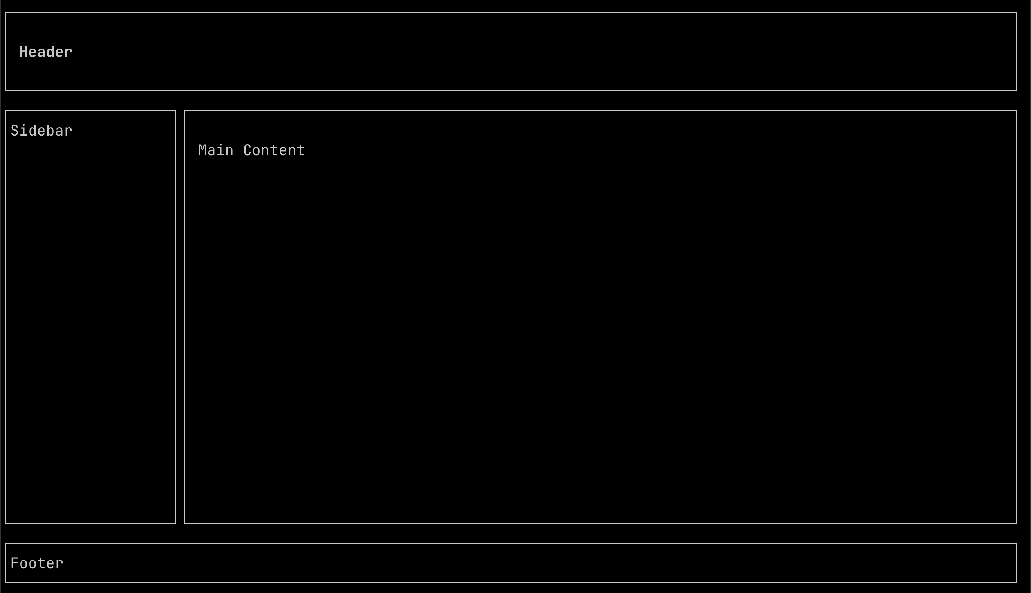
Here's a dashboard layout as a .gsx component:
templ Dashboard() {
    <div class="flex-col h-full">
        <div class="border-single p-1">
            <span class="font-bold">Header</span>
        </div>
        <div class="flex-row grow">
            <div class="w-20 border-single">Sidebar</div>
            <div class="grow border-single p-1">Main Content</div>
        </div>
        <div class="border-single">Footer</div>
    </div>
}
flex-col stacks the three sections vertically. grow on the middle section
takes whatever vertical space remains. Inside, w-20 pins the sidebar at 20
characters, and grow fills the rest. The layout engine figures out the
coordinates.
Most of the time I spent on this went into reading the CSS spec, misunderstanding
some part of it, implementing my misunderstanding, and then fixing it when a test
case (or my eyes) told me something was off. The code is all in
internal/layout. It's about 600 lines.